equipment | Nike+ FuelBand SE
_Summary | stylish motivation missing out on the basics
Just got the NIKE+ FUELBAND SE in the mail the other day. After months of considering whether to get the JAWBONE UP, the FITBIT FLEX; the POLAR LOOP or the NIKE+ FUELBAND SE I finally decided for the latter. The decision was not an easy one as the FUELBAND SE isn’t necessary the cream of evolution among the activity trackers.
It does not track movement acurrately except walking, it does not work in water, it does not measure pulse, heartrate or anything concretely related to your body, it only connects with iOS devices and actually only really with the iphone.
However on the upside for me, and what finally made the decision, was the combination of the following: screen/on device visualization, design and flexibility, plus above all it doubles as a stylish watch. And to be honest the watch function finally did it for me. From an activity tracking perspective the JAWBONE UP is supposedly better and has more functions, as well as an Android Ap, the FITBIT FLEX is lacking visualization. The POLAR LOOP sadly only came into the game when the shipped FUELBAND SE had already arrived, otherwise I would have decided for the LOOP potentially, as it measure more relevant functions (i.e. heartrate and frequency, better watch functionalities, etc.).
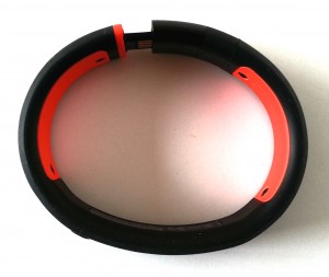
- Nike+ | Fuelband SE – Clasp
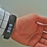
- Nike+ | Fuelband SE – Watch
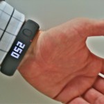
- Nike+ | Fuelband SE – Fuel
First test days
- Measurement accuracy
This is the biggest weakness. The FUELBAND SE only works for linear activities, like walking, jogging, running, etc. anything more static or even vertical activities are not tracked appropriately, e.g. climbing, gym training, etc. Additionally it is not really waterproof, showering is ok, surfing, diving or even swimming is not recommended. So far I did not have any issues, but only wore it during showering. I find it peculiar that my short car ride to work (5min = 5 km) adds more points than my climbing training session (60min). In my view this is jumping a bit too short, particularly for a Brand like Nike, disappointing… - Design
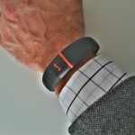
This is clearly the strength of the FUELBAND SE: sleek, smooth, not too fancy, not too big, but rather light at the wrist. The display is smartly placed and due to the fact it only lightens up if you press the adjacent button, the display is invisible when not activated. - Functionalities
The functionalities are a bit limited from my perspective, particularly if you do any additional sport to running. Thus I would love to have a heart-rate sensor or anything that connects to the pulse or bodily reactions to excercise. The biggest weakness in my book only topped by the unbelieveable stupidity of Nike to exclusively rely on Apple as the supported iOS. In plain speak: NO ANDROID APP!!! Yes, indeed, absolutely unbelievable and there is not even one in planning according to all internet resources right now (18.02.2014).
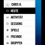
- Nike+ | Fuelband SE – Main menue
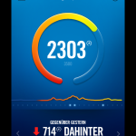
- Nike+ | Fuelband SE – Daily summary
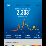
- Nike+ | Fuelband SE – Daily overview
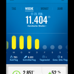
- Nike+ | Fuelband SE – Weekly summary
Price: 139€
Shop: Nike Store
Additional test resources:
